Tooltip Basics
Tooltips provide extra data regarding the features and elements in a page. It is triggered by consumer behaviour upon visiting their website. Tooltips are not a very popular feature in the digital world often misused and misinterpreted, however, given it is integrated accordingly, it can help the website render a better user experience.
What is a Tooltip?

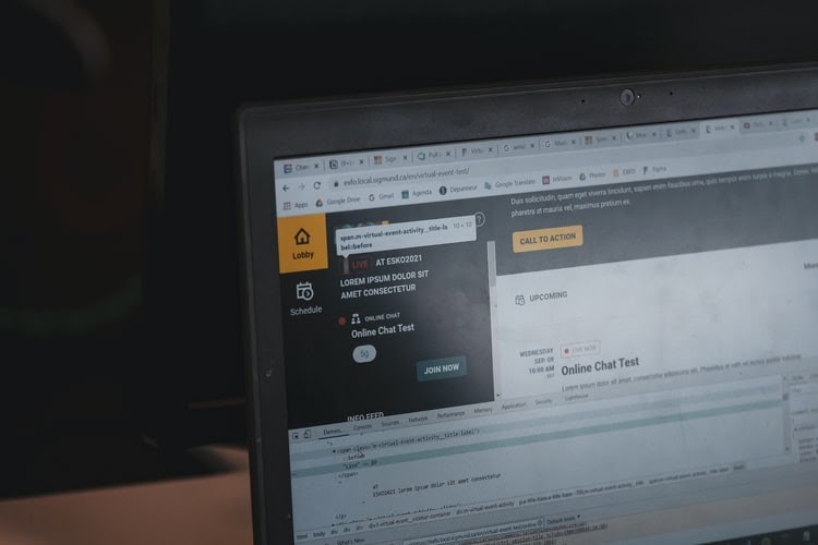
Tooltip is a concise but informative message that pops up when the user hovers through a random graphical element on the website. It appears when the user interacts with the GUI or graphical user interface element in the page. It is triggered by either mouse-hovering or keyboard-hovering.
Typically, tooltips are attached to icons, texts, links, buttons, and other active elements on the site. These active elements carry definitions or explanations relative to the element. It only provides a brief explanation about the context but enough to provide information for a better understanding of the company’s operations.
As was mentioned, tooltips are triggered by a mouse or keyboard hover. Thus, it doesn’t work or apply on touchscreen devices such as tablets, phones, etc.

Tooltips vs. Popup Tips
While tooltips work only on desktop or laptops, popup tips provide the same service for touchscreen devices, even both. Given that both have the same goal, they also have differences:
| Tooltips | Popup tips | |
| Type of Device | Desktop | Any |
| Initiated by | Hover (mouse or keyboard) | Touch, hover or click |
| It terminates when | When the user points the mouse somewhere else | When the user taps to close or clicks another area of the screen |
| Paired element | Icon, text link, button, image | “?” and “i” |
| Type of Content | Microcontent | Microcontent |
Tooltip-Usage Guidelines
- Avoid using tooltips for data that is relevant for completing the task. It is best to provide additional information for a better understanding of what the task or operation is about and who is involved but not to tell the user exact data like giving out the standard password requirement.
- Provide only concise and useful information. Avoid integrating repetitive texts that are not of use to your visitors. Also, a tip composed of a whole paragraph is no longer a tip. Hence, avoid incorporating long and winding messages in your tooltip.
- Your tooltip must work on both mouse and keyboard hovers. Desktop or laptop users rely a lot on either the keyboards or mouse to navigate a website. Hence, if your tooltip does not work on both, your web design will only be limited to whichever it works.
- Use tooltip arrows to direct the user when there are several elements that are neighbouring. It will be easier for the user to go from one tooltip to another without getting lost or confused about which is which.
- Make use of tooltips all throughout your website. Display it in plain sight so the user will know and notice that it is there carrying relevant information about your site. It can greatly help your visitors gain a broader understanding of your website and your operations online. It will also provide answers as to why certain data are asked from your users.
- If you have unlabelled icons on your website, it is ideal to provide a tooltip for your users to know what it is.
- Make sure your tooltip projects a subtle contrast to your website’s background and complements other elements around it. Your text fonts must also be simple and easy to read.
- If you have related content around the active element, make sure your tooltip pops in the right area where it doesn’t cover elements that are related.
Tooltips boost user experience. If you want your website to clearly deliver your content to your users, optimise tooltips to your active elements and give your visitors information they need, and want at that moment they hover through your website.


