Trending 2021 Website Color Schemes
Website design is your brand’s face in the digital world. It has to embody your brand image, marketing goals, and products/services. While online trends are constantly changing every year, your website aesthetics must also appeal to the ever-changing wants of the tech-savvy generation.
If you are currently working on your website’s new face or building a new website for your brand, one of the first few things you need to carefully curate is the colour scheme of your website. Colours extend certain effective to viewers. Each colour has meaning and important effects in terms of marketing. While red projects strong character and urgency, green represents either money or nature. Depending on the kind of brand you own, your colour must be parallel to every detail and goal in your digital marketing journey. Colours communicate visually. Thus, we handpicked the latest colour palettes that are in this year.
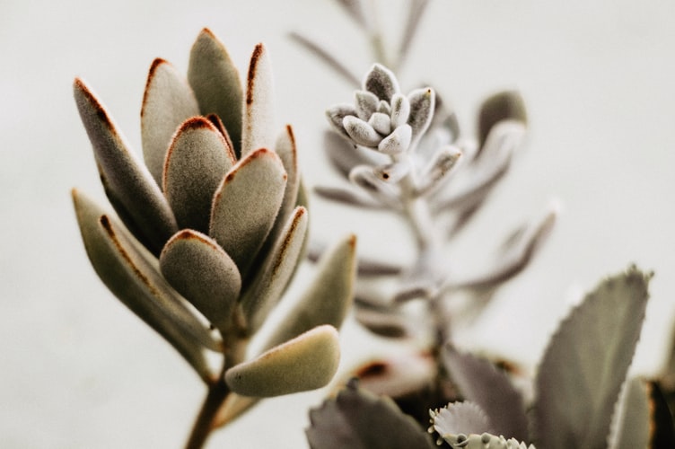
Soft Tones
Soft tones gained a lot of attention in 2020 but it’s here to stay a little bit longer this year. These subtle palettes exhibit classy, subtle hues that are appealing for fashion brands such as jewellery stores, artisan shops, and elegant clothing lines. Using muted colours can accent your products in a way that compliments them while highlighting your product’s details. With a perfect balance of soft-toned palettes and negative spaces, your website design will never go out of style in the years to come.
Cool and warm Grays, Off-White, and a Pop of Vicious Red
Combining neutrals with the strong character of red will create a focus that will be helpful in leading your visitors to look at the important elements in your website. For pages that need to incorporate a lot of text on their pages, using a pop of red to highlight important information is very effective in keeping your visitors engaged and away from confusion. A good example of such an approach can be this website: https://visionsafe.com.au/

Blue and Green Gradients with White Text
Blue and green are a perfect combination if you want to flaunt a cool breezy easy to look at website, however boring. But, the blue and green combined with gradients appeals more to this modern generation. Blue projects trustworthiness; hence, used mostly by websites that engage in online financial transactions such as PayPal. Gradients, on the other hand, are perfect for websites that want multiple hues blended subtly. Add up white texts and your website is ready for launching. Simple. On-trend. Effective.
Vintage Orange and Red Tones’
Retro is making a big comeback this year. Not only with fonts but also with colour schemes. Retro colours are mostly a series of muted colour combinations that project creative classic images to viewers. From the 1970s to the 90s, many brands are finding inspiration from old school posters, marketing materials, and even movie colour grading to use for their brand’s website. The use of retro colours, not only gives the company a new life to what’s old, but it also brings familiar senses to their target market.
How can a classic become something modern? Quite an oxymoron but with the boundless creativity of today’s generation, balance is the key. If you totally copy the retro, then it stays retro even. However, retro can be modern if some elements that aren’t timeless are eradicated. Thus, retro plus minimalist appeal equal modern design.
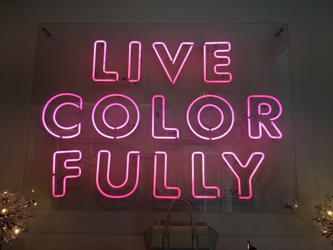
Soft Pink, Bright Pink, and Jet Black
If you think about a pink website, one will immediately think it’s a brand that sells women’s delicates, beauty products and anything for the women market. But, pink does not necessarily mean it’s for girls. Pink can also be used in websites that sell bikes, surfboards, and other products intended for men’s extremities.
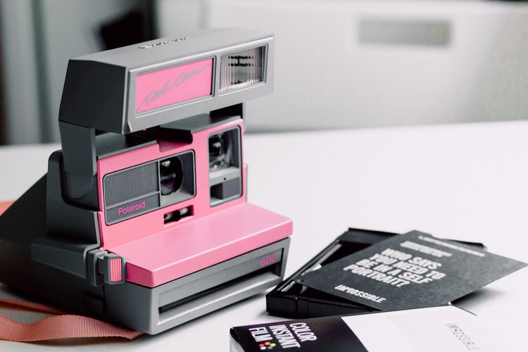
The combination of soft and bright pink highlights jet black-coloured products. Also, it exudes elegance subtly with a touch of extreme modern living. Soft pink is an amazing background for jet black or dark coloured products while bright pink can serve as your accents to add more details to your page.
The options are endless. All you need to do is to choose one that best fits your taste, brand, and products. Colours help in keeping your visitors engaged and effective in attracting newcomers. Colours that pop, subtle, dark, retro, or modern, whatever it is that you prefer, just keep in mind one thing: balance.